Table of Contents
# Boring Beige and Whites
# Unflattering Pastels
# Clashing Brights
# Mismatched Trim and Wall Colors
# Inconsistent Color Blocking
# Overemphasis on Neon or Metallics
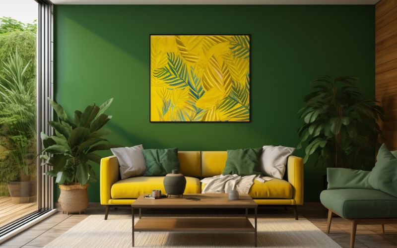
# Monochromatic Madness
“The secret to using color is to not overdo it. Colors should be used strategically to create a desired effect, not to overwhelm or cheapen the space.” – Nate Berkus.
Choosing the perfect paint color for your house can be quite a daunting task. It can be tempting to go for bold and soft colors to make your home stand out. However, if not done right, your choice of color combinations can leave your house looking cheap and tacky.
The improper color scheme can make your home look unattractive and discordant, far from the refined haven you envision.
In this blog, we will look at a list of 7 house paint color combinations that you should steer clear of.
1. Boring Beige and Whites
Beige and white may seem like safe and neutral choices, but when used together, they can make a house look dull and unimaginative. Instead of creating a welcoming and inviting atmosphere, these color combinations can make your house appear plain and uninspiring. Consider using warm and earthy tones to add depth and character to your home.
2. Unflattering Pastels
Pastel shades can be delightful when used in the right context, but combining multiple pastel colors together can make your house look like a children’s playhouse. Too many light and soft colors can give off a juvenile vibe that cheapens the overall look of your home. Opt for more sophisticated and mature tones to enhance the elegance of your house.
If you are confused about color psychology in house painting then consult professional home painting services Kolkata for better consultation and services.
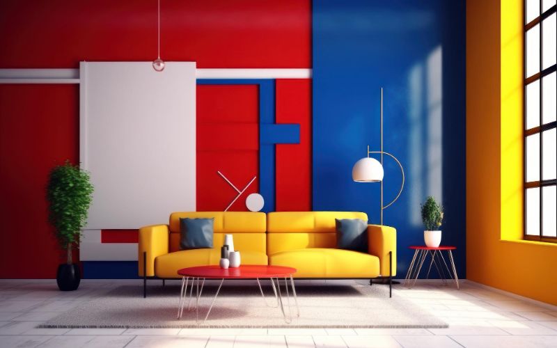
3. Clashing Brights
Using bold and vibrant colors can be a great way to add personality to your home. However, combining contrasting bright colors can lead to an overwhelming visual effect that can make your house look chaotic and cheap. If you want to incorporate bright colors, choose one as the main accent and pair it with muted or neutral tones to create a balanced and pleasing aesthetic.
4. Mismatched Trim and Wall Colors
It’s important to choose complementary colors for your trim and walls. If the colors clash or do not harmonize, it can create an unappealing look that cheapens the appearance of your house. Ensure that the colors you choose for your trim and walls complement each other and create a cohesive and harmonious look.
5. Inconsistent Color Blocking
Color blocking is a popular trend that involves using multiple colors in different sections of a room or house exterior. However, if the colors are not applied consistently or are chosen poorly, it can result in a messy and cheap-looking appearance. Make sure to plan your color blocking carefully, ensuring that the colors flow seamlessly and enhance the overall aesthetic of your home.
6. Overemphasis on Neon or Metallics
Neon and metallic colors have their place, but excessive use can make your house look like a disco fever dream. These colors are best used as accent colors to add a pop of interest and excitement. Avoid overusing neon or metallic shades as the primary colors for your house, as it can give off a gaudy and kitschy vibe.
7. Monochromatic Madness
While monochromatic color schemes can be sophisticated and stylish when done right, using the same color in various shades throughout your house can make it look monotonous and cheap. To avoid this, try incorporating contrasting colors or hues within the same color family to create depth and visual interest.
Are You Looking for Painting Contractors in Kolkata?
If you are looking for painting contractors in Kolkata then choose 123 Home Paints. They know the right color psychology and Incorporate best color to your house. We believe in customer satisfaction and hassle free work.
Conclusion
In conclusion, the paint color combinations you choose for your house can greatly impact its overall appearance. Avoiding these 7 color combinations will help you create a home that looks sophisticated and expensive. Remember to keep balance, harmony, and your personal style in mind when selecting colors for your house.